


 77 / 140

design
mag |
77
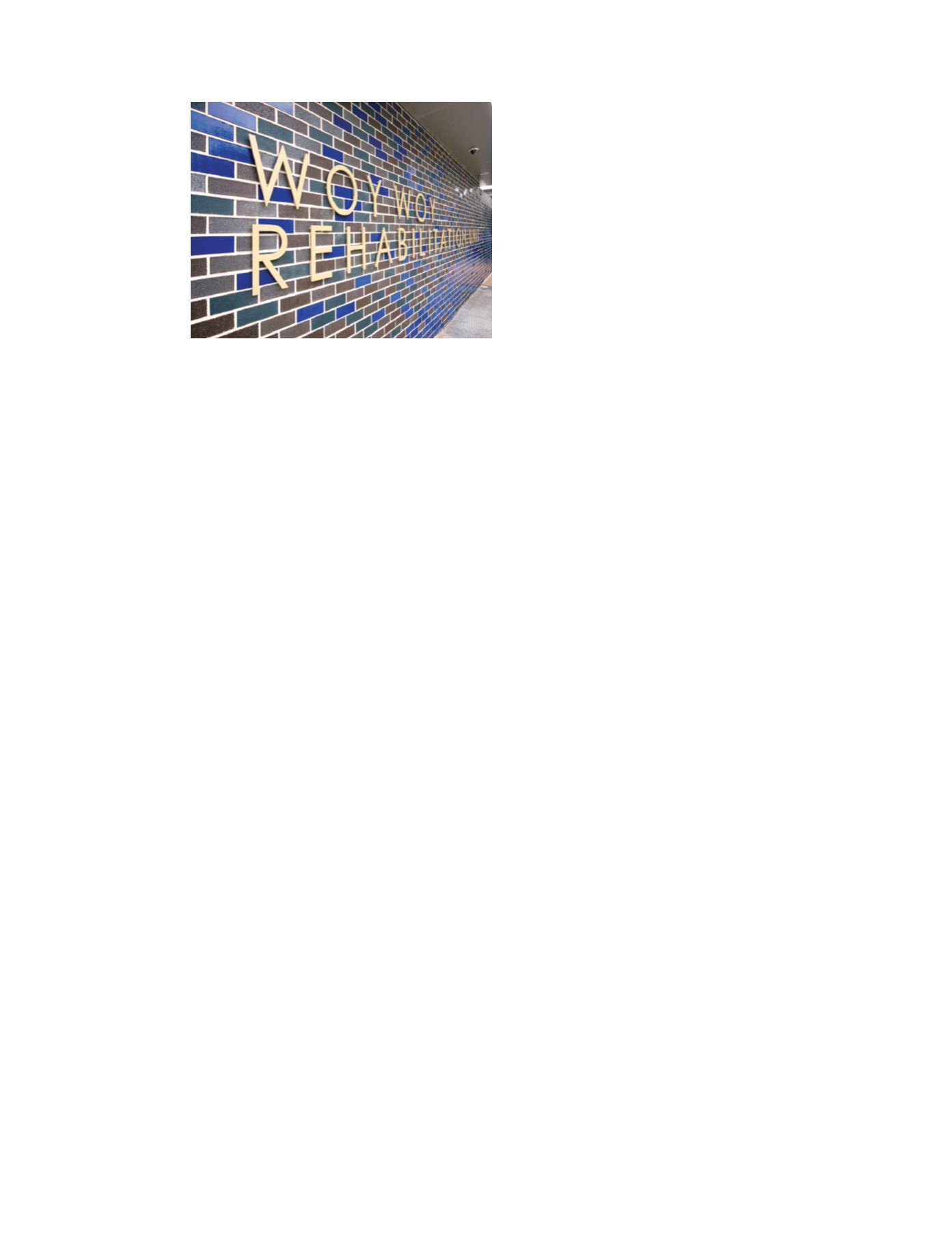
Sole use of the glossy blue bricks may have been visually
overwhelming. However they came into their own as part
of a mottled pattern when teamed with more
conventional bricks in blacks, browns and greys.
So what was the factor used as the design variable for the
brickwork patterning? “We had a bit of a play on the
roofs,” says Khaled.“As you walk around the buildings you
can appreciate how we shaped the roofs.They are your
normal hip roof but we did a bit more pushing and
shoving to bring natural light into the centre of the
building.And we played on that in the walling.”
Using Rhino 3D modelling software, the designers drew
deviation lines that essentially followed the roof lines
above each wall.“In effect it’s a mirror of what the roof
does above. In some cases where it was an end of a wall,
that’s where the concentration of blue bricks was intense
on one side and started vanishing towards the end.”
The blue is at its most prominent at the entrance and all
but disappears at back-of-house areas.“We wanted the
blue bricks where we could see them at the entry sides
and the back where patients are.The lines follow the roof
in most cases and sometimes just disappear when they
need to at the end of a wall.”
While the software indicated how many Smashing Blue
bricks were needed in a section of walling and the line
their placement was to follow, the final creative control
was left to the bricklayer.Although it would have been
possible to detail every brick placement, this solution was
more practical and added another creative dimension.
The design makes further use of brickwork’s modularity to
create hit-and-miss (or perforated) walling which allows
light penetration and ventilation while maintaining
privacy.A section of hit-and-miss features in the southern
wall separating the two residential pods. It allows light into
the maintenance-access courtyard and the adjacent
glass link.
Another hit-and-miss wall flanks the staff courtyard.“We
wanted to give it some privacy but not kill it from the
ventilation and light point-of-view and to maintain a soft
link with the building’s geometry,” Khaled explains.
After an expenditure of $11.6 million, the Woy Woy
Rehabilitation Unit opened in mid-2013 to the acclaim of
local residents who love their town despite its odd name.
Spike Milligan once mused that if the name comes from
the local indigenous words meaning ‘deep water’ then
“which Woy means ‘deep’ and which Woy means ‘water’?
It makes you think.”
You can’t help but believe that the zany and “random”
wall patterns of the new Rehabilitation Unit would have
appealed to an unconventional thinker like Spike Milligan.
The Unit, designed by Woods Bagot, comprises three
buildings that are keyed into the rear of the existing
hospital but are operationally separate. Sited within a
parkland environment, the buildings or “pods” are
grouped in an inverted L-shape around a car park.The
two pods to the east are residential, while the upper
section of the western pod houses clinical facilities,
dining and lounge rooms, gymnasium and nursing
functions.The entrance is located at the link between
the residential pods and the western pod.The lower
section contains ancillary services for the entire campus
such as linen, mechanical services and stores.
The internal design of any health care facility is a matter
of striking a balance between patient needs and
operational efficiency, and well beyond the scope of this
article. Health care building projects, especially those
funded by the public purse, are not known for their lavish
budgets. So how did the exterior of this small regional
facility come to have such an eye-catching
appearance?
“Health projects come under a really tight budget,” says
Woods Bagot associate Mohammed Khaled,“and you
have to start thinking of creative ways of making the
buildings more interesting.” His solution was to use the
modularity inherent in brickwork to create a series of
seemingly-random pixellated patterns.The factor that
varies this patterning is a little unusual and will be
revealed later.
Why brick is a simpler matter:“Conceptually we wanted
to have a building that was on a scale sympathetic to
the surroundings. So obviously this influenced the height,
roof forms and the choice of walling material, namely
brick.”
The dominant brick is Austral Bricks Burlesque, a
fully-glazed clay masonry unit in Smashing Blue, an
obvious colour choice for a coastal location.