Basic HTML Version


design
mag |
13
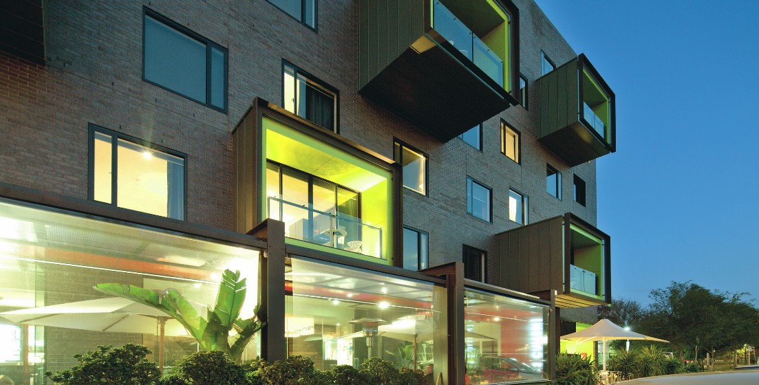
Brick was the façade material of choice
from the early concept meetings.“We liked
the craftsmanship of brick and the fact that
it’s literally laid one by one, so there’s more of
a finer grain to it,” Kennon reflects.“There is
precedent for it standing the test of time so
it gives the building longevity.”
Detailed set-out of the brick courses was
essential in such a large construction to
ensure corners ended on whole bricks.
Computer-aided design allowed the
placement of every brick to be readily
detailed.The brickwork sits on shelf angles
at each level.
Mortar joint colour and finish is always an
essential design consideration.A dark
charcoal colour was selected after site
testing.The joints have a shallow, ironed
(half-round) finish.
“It was a bold move for Jackson Clements
Burrows to go with Elements Zinc bricks,”
Capitol Commercial Architecture’s Jeff Porter
considers,“but I think it’s been a very
successful choice.”
The Cullen has received a number of
accolades including placement in the
prestigious Condé Nast Traveller Hot List.
“Choosing the painter Adam Cullen,
Australian art’s angst-ridden enfant terrible,
as the inspiration for The Cullen has proved
a masterstroke,” said the Condé Nast judges
who described the building as “cleverly
designed” with “visual provocation
(awaiting) at every turn.”
previous page.
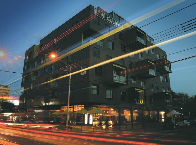
The first in
a series of art-themed,
boutique hotels,The Cullen
is in busy Commercial Road,
near the popular Chapel
Street shopping and
entertainment precinct.
from left.
The “push-pull”
facade design adds
dimension whereas the
brickwork imparts a more
monolithic appearance.
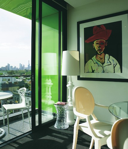
Internally, the hotel features
works by controversial artist
Adam Cullen in the suites
and public areas.The
semi-glazed bricks change
colour as they reflect the
ever-changing light.
Photography:
John Gollings, Michael Laurie

